Goals
As an outside agency, my team had a limited scope for this project. Not all insights from discovery were designed for, and not all designs were built.
- Make content throughout the site easier to find
- Improve accessibility in the design and build
- Set appropriate expectations for a visit
- Enhance the overall visual styling which stakeholders already liked
The Museum saw consistently high traffic, but stakeholders wanted to address common sources of confusion for first-time visitors, help visitors identify and learn about objects in the collection, and increase event sign-ups.
Finding my way in Boston
My team and I had the privilege of visiting the Museum for a tour and discovery workshop.
Our discovery workshop included close to 30 people, between the client and agency teams, and we were looking for a lively discussion. I arrived that morning with two exercises prepared and some idea of how we would move through them, but once I saw the meeting room, I realized we needed to break into groups and split the discussion topics. When the time came, moving between small groups and full-room discussion got us the energy and information we were looking for, while spreading out my teammates through the 4 groups meant that we collectively learned everything we needed.
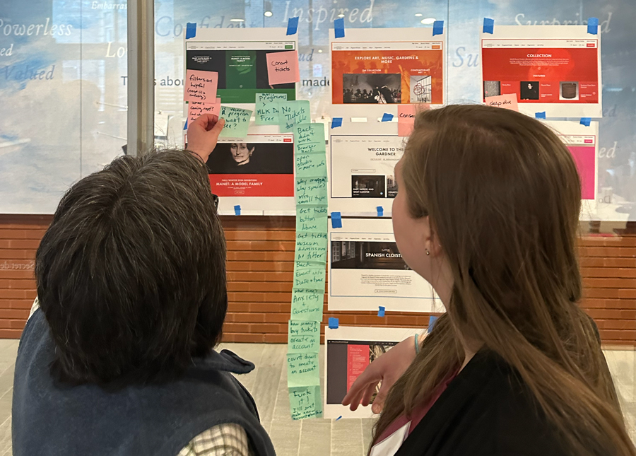
And what’s a workshop without sticky notes?
In the end, we walked away with:
- A sense of design inclination from a visual gut check exercise. We looked at a variety of page types for museums and other visitor attractions. When considering the pages from a design perspective, participants were surprised to realize what they liked (a few components from a competitor, and the layout of certain content for an aquarium) and what they wanted to avoid (including some choices from well-respected institutions).
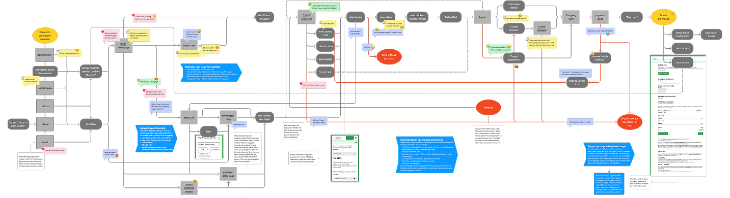
- Deeper insight into the ticketing process from a user journey workshop. For this exercise, we walked through the steps it takes to purchase a ticket to the Gardner Museum online, an experience that most of the Museum staff present had never had before. The SMEs helped us understand where they knew users ran into trouble, and gained a new appreciation for the user experience as they went through it first-hand.
- Heightened trust and respect in both directions. With the breakout groups, we heard from people we wouldn’t have otherwise, from the Museum’s director to quieter voices with lots of hands-on experience. Though still early in the project, we assured the Museum team that we knew what was important to them, showing that they could trust us with their website.