
In May 2016 and November 2017, I made and published two separate infographics introducing basic information on adoption.
graphic design, research, writing
Bethany McDaniel, Susan Boatwright, Deborah Burrus, Fran Marie H. George, Jon Suggs
Different people learn in different ways.
Psychologists disagree on a lot, but they tend to agree that imagery helps.
Effective images are easier to understand and remember than words. Certain information means very little to most people until they see it visually. From cave paintings to traffic signs, images have driven communication for millennia.
This is all great news for infographics. What’s even better for marketers and businesspeople — they do crazy well on social media. And that can be pretty powerful when 45% of adults get their news on Facebook. *gasp*
Most topics that I visualize for Georgia.gov I pick myself. I look for:
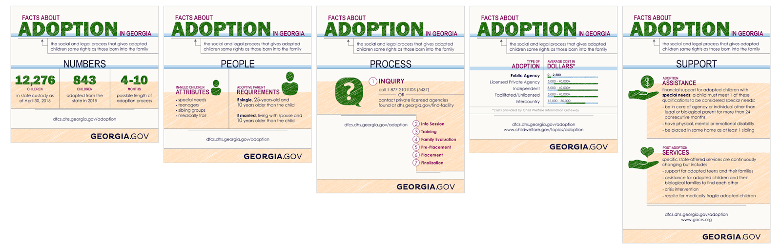
I chose to cover adoption because it’s a topic that’s always meant a lot to me, it included statistics and steps, and I knew it could translate into some fun visuals.
I worked with public information and content matter experts at the Georgia Department of Human Services (DHS) to gather the facts and plan out what to include.

The graphic needed to convey childlike innocence. So I went for a scribble effect and playful color palette.

After some back and forth with DHS, we landed on the final graphic.

We host our full infographics on the Georgia.gov blog. For the clearest picture, I upload the file as an SVG, and for accessibility, I provide an on-page text version of the graphic. You can read more about how we implemented infographics on Georgia.gov in my blog series.
We post regularly to Facebook and Twitter. And we know sharing infographics on social media is one of the most effective ways to get them seen.
But we realized a couple challenges:
To address both problems, I break up every infographic into logical pieces to share over time.
All this work… Where’s the payoff, right?
First, let’s define success. We’re government, so we’re not trying to sell ads or products. The end goal for a piece like this is education.
We want to know people saw it and care about it.
Simple enough.
So I compared the pageviews to a text-only blog post from the previous year on a similar topic, fostering.
Looking at Google Analytics for the first two weeks of each post, I saw:

The numbers are up! That’s a great start.
Social media was the true test. We knew that this was where our infographics would shine the brightest. And let me tell you, we were not disappointed.
According Facebook's built-in analytics, the first piece of the infographic received:

We wanted people to see it. We wanted them to care. Based on those numbers, I’d bet they did.
I published this graphic just a few weeks before speaking about infographics at my team’s semi-annual GOVTalks conference. For more on the what, why, and how of infographics, check out the recording of my talk.
After the grand success of the adoption overview graphic, I decided to revisit the topic in the next year. This time, I focused on the process of adoption, rather than a general overview.
Putting it together this time was much simpler, since I wanted to duplicate the look and feel of the former graphic. DHS sent me updated numbers and I stuck those in with the new information and icons.
